
PuneetOptionTrading: True Trading & Investment Advisory…..Planned Ultimate New Extraordinary Earning Thoughts With
Observation Planning Timing In Out Nexus
Track Returns Aroma Daily Indescribably Next To Great
सीखना तो पड़ेगा……………………………………………………………………….
Don't miss the opportunity to earn money…………………………….
Before Trading. First Check your Risk, Advice is ours……. Decision is yours
Don't trade without Stop Loss. Always think for stop loss than go for the target
Key points to remember before trading………………………………………
· Avoid following the tips of anybody
· Avoid leveraged positions
· Avoid multiple positions
· Set targets and Book profits
· Always put strict SL/Stop loss
· Never average a falling stock
· Learn basics of Technical & Fundamental Analysis
Contact us at : +91-9760323370, +91-8630008025
|
Email: puneetgmrt@gmail.com
|
Telegram: https://t.me/puneetoptiontrading
|
Facebook: https://facebook.com/pg/puneetoptiontrading
|
Twitter Handle: @puneetoptiontrading
|
Thanks & Regards
|
PuneetOptionTrading
|
Puneet Gupta
|
Financial Planner & Research Analyst
|
जय हिन्द जय भारत
Stock Market : How to Learn and What to Learn?
Anything in this world, we don't learned yet....... seems to be tough but when we start learning, whatever we want to learn, gradually it becomes easy for us, after start, learning and practice. We should start early and if we become late to learn, we should not hesitate. After learning, when you will start your work, you will managed to do your work easily, efficiently & accurately and you will be confident and will also enjoy your work. Your work will be perfect and you never will feel tired. Beginners taking their first steps towards learning the basics of stock Market should have access to sources of quality education. Trial and error coupled with the ability to keep pressing forth will eventually lead to success.You may begin stock market learning yourself by reading books,newspapers & articles, seeing videos on youtube, Following Business channels and by so many ways. After taking first step towards learning, you may join an institute or academy, various online programs, seminars or by associating with some good teacher/trainer/mentor.To learn stock market there may be following categories:
1. Stock Market Basics
2. Fundamental Analysis
3. Technical Analysis
4. Money Management
5. Trading Psychology
First off all we will focus on Technical Analysis.
1. Candle sticks types,Behaviour & Patterns
Candlestick charts are a type of financial chart for tracking the movement of securities. They have their origins in the centuries-old Japanese rice trade and have made their way into modern day price charting. Some investors find them more visually appealing than the standard bar charts and the price actions easier to interpret.
Candlesticks are
so named because the rectangular shape and lines on either end resemble a
candle with wicks. Each candlestick usually represents one day’s worth of price
data about a stock. Over time, the candlesticks group into recognizable
patterns that investors can use to make buying and selling
decisions.


How to Read a Single Candlestick
Each candlestick represents one
day’s worth of price data about a stock through four pieces of information:
the opening
price, the closing
price, the high price, and the low price. The color of the central
rectangle (called the real body) tells investors whether the opening price or
the closing price was higher. A black or filled candlestick means the closing
price for the period was less than the opening price; hence, it is bearish and
indicates selling pressure. Meanwhile, a white or hollow candlestick means that
the closing price was greater than the opening price. This is bullish and shows
buying pressure. The lines at both ends of a candlestick are called shadows, and
they show the entire range of price
action for the day, from low to high. The upper shadow shows the
stock’s highest price for the day, and the lower shadow shows the lowest price
for the day.


- Dark Cloud Cover
A bearish reversal pattern that continues the uptrend
with a long white body. The next day opens at a new high, then closes below the
midpoint of the body of the first day.


- Doji
Doji form when the open and close of a security are
virtually equal. The length of the upper and lower shadows can vary, and the
resulting candlestick looks like either a cross, inverted cross or plus sign.
Doji convey a sense of indecision or tug-of-war between buyers and sellers.
Prices move above and below the opening level during the session, but close at
or near the opening level.


- Downside Tasuki Gap
A continuation pattern with a long, black body followed
by another black body that has gapped below the first one. The third day is
white and opens within the body of the second day, then closes in the gap
between the first two days, but does not close the gap.

- Dragonfly Doji
A Doji where the open and close price are at the high of
the day. Like other Doji days, this one normally appears at market turning
points.


- Engulfing Pattern
A reversal pattern that can be bearish or bullish,
depending upon whether it appears at the end of an uptrend (bearish engulfing
pattern) or a downtrend (bullish engulfing pattern). The first day is
characterized by a small body, followed by a day whose body completely engulfs
the previous day's body and closes in the opposite direction of the trend. This
pattern is similar to the outside reversal chart pattern, but does not require the entire range (high and low)
to be engulfed, just the open and close.


- Evening Doji Star
A three-day bearish reversal pattern similar to the
Evening Star. The uptrend continues with a large white body. The next day opens
higher, trades in a small range, then closes at its open (Doji). The next day
closes below the midpoint of the body of the first day.


- Evening Star
A bearish reversal pattern that continues an uptrend
with a long white body day followed by a gapped up small body day, then a down
close with the close below the midpoint of the first day.


- Falling Three Methods
A bearish continuation pattern. A long black body is
followed by three small body days, each fully contained within the range of the
high and low of the first day. The fifth day closes at a new low.


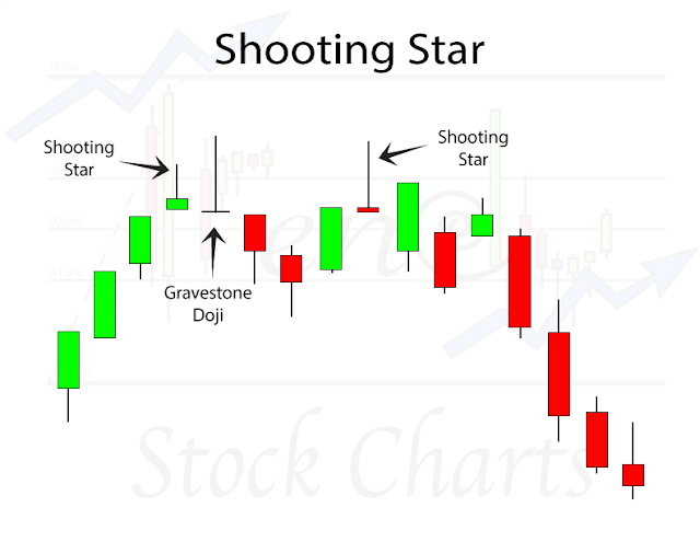
- Gravestone Doji
A doji line that develops when the Doji is at, or very
near, the low of the day.


- Hammer
Hammer candlesticks form when a security moves
significantly lower after the open, but rallies to close well above the
intraday low. The resulting candlestick looks like a square lollipop with a
long stick. If this candlestick forms during a decline, then it is called a
Hammer.


- Hanging Man
Hanging Man candlesticks form when a security moves
significantly lower after the open, but rallies to close well above the
intraday low. The resulting candlestick looks like a square lollipop with a
long stick. If this candlestick forms during an advance, then it is called a
Hanging Man.


- Harami
A two-day pattern that has a small body day completely
contained within the range of the previous body, and is the opposite color.


- Harami Cross
A two-day pattern similar to the Harami. The difference is that the last day is a Doji.


- Inverted Hammer
A one-day bullish reversal pattern. In a downtrend, the
open is lower, then it trades higher, but closes near its open, therefore
looking like an inverted lollipop.


- Long Body / Long Day
A large price move from open to close, where the length
of the candle body is long.


- Long-Legged Doji
This candlestick has long upper and lower shadows with
the Doji in the middle of the day's trading range, clearly reflecting the
indecision of traders.


- Long Shadows
Candlesticks with a long upper shadow and short lower
shadow indicate that buyers dominated during the first part of the session,
bidding prices higher. Conversely, candlesticks with long lower shadows and
short upper shadows indicate that sellers dominated during the first part of
the session, driving prices lower.


- Marubozu
A candlestick with no shadow extending from the body at
either the open, the close or at both. The name means close-cropped or
close-cut in Japanese, though other interpretations refer to it as Bald or
Shaven Head.


- Morning Doji Star
A three-day bullish reversal pattern that is very
similar to the Morning Star. The first day is in a downtrend with a long black
body. The next day opens lower with a Doji that has a small trading range. The
last day closes above the midpoint of the first day.


- Morning Star
A three-day bullish reversal pattern consisting of three
candlesticks - a long-bodied black candle extending the current downtrend, a
short middle candle that gapped down on the open, and a long-bodied white
candle that gapped up on the open and closed above the midpoint of the body of
the first day.


- Piercing Line
A bullish two-day reversal pattern. The first day, in a
downtrend, is a long black day. The next day opens at a new low, then closes
above the midpoint of the body of the first day.


- Rising Three Methods
A bullish continuation pattern in which a long white
body is followed by three small body days, each fully contained within the
range of the high and low of the first day. The fifth day closes at a new high.


- Shooting Star
A single day pattern that can appear in an uptrend. It
opens higher, trades much higher, then closes near its open. It looks just like
the Inverted Hammer except that it is bearish.

- Short Body / Short Day
A short day represents a small price move from open to
close, where the length of the candle body is short.

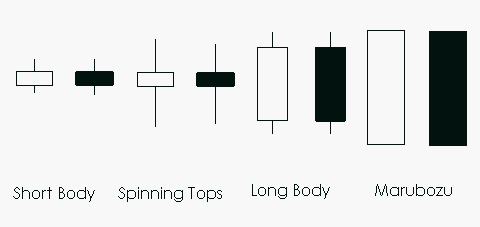
- Spinning Top
Candlestick lines that have small bodies with upper and
lower shadows that exceed the length of the body. Spinning tops signal
indecision.


- Stars
A candlestick that gaps away from the previous
candlestick is said to be in star position. Depending on the previous
candlestick, the star position candlestick gaps up or down and appears isolated
from previous price action.


- Stick Sandwich
A bullish reversal pattern with two black bodies
surrounding a white body. The closing prices of the two black bodies must be
equal. A support price is apparent and the opportunity for prices to reverse is
quite good.


- Three Black Crows
A bearish reversal pattern consisting of three
consecutive long black bodies where each day closes at or near its low and
opens within the body of the previous day.
- Three White Soldiers
A bullish reversal pattern consisting of three
consecutive long white bodies. Each should open within the previous body and
the close should be near the high of the day.


- Upside Gap Two Crows
A three-day bearish pattern that only happens in an
uptrend. The first day is a long white body followed by a gapped open with the
small black body remaining gapped above the first day. The third day is also a
black day whose body is larger than the second day and engulfs it. The close of
the last day is still above the first long white day.


- Upside Tasuki Gap
A continuation pattern with a long white body followed
by another white body that has gapped above the first one. The third day is
black and opens within the body of the second day, then closes in the gap
between the first two days, but does not close the gap.


- Pennant & Flag
- Cup & Handle
- Ascending Triangles
- Triple Bottom
- Descending Triangles
- Inverse Head and Shoulders
- Bullish Symmetrical Triangle
- Rounding Bottom
- Flag Continuation
- Double Top
- Bearish Symmetrical Triangle
- Falling Wedge
- Head and Shoulders
What Stock Chart Patterns Should I Look Out For?Why not print out this article and you will have the answer right next to you whenever you need it. All of the most common patterns and what they mean to you as a trader are highlighted here. Keep this by your desk and I promise it will be a huge help in the coming weeks and months. Just having them in your face each and every day will subconsciously help you learn to recognize them during live trading.
1. Pennant
A pennant is created when there is a significant movement in the stock, followed by a period of consolidation – this creates the pennant shape due to the converging lines. A breakout movement then occurs in the same direction as the big stock move. These are similar to flag patterns and tend to last between one and three weeks. There will be significant volume at the initial stock movement, followed by weaker volume in the pennant section, and growth in volume at the breakout.

2. Cup And Handle
A cup and handle pattern gets its name from the obvious pattern it makes on the chart. The cup is a curved u-shape, while the handle slopes slightly downwards. In general, the right-hand side of the diagram has low trading volume, and it can last from seven weeks up to around 65 weeks.

3. Ascending Triangle
This triangle usually appears during an upward trend and is regarded as a continuation pattern. It is a bullish pattern. Sometimes it can be created as part of a reversal at the end of a downward trend, but more commonly it is a continuation. Ascending triangles are always bullish patterns whenever they occur.

4. Triple Bottom
The Triple Bottom pattern is used in technical analysis as a predictor of a reverse position following a long downward trend. The Triple Bottom occurs when the price of the stock creates three distinct downward prongs, at around the same price level, before breaking out and reversing the trend.

5. Descending Triangle
The descending triangle is another continuation pattern, but this triangle is a bearish pattern and is usually created as a continuation during a downward trend. Occasionally it can be seen as a reversal during an upward trend (the opposite of the ascending triangle pattern), but it is considered to be a continuation.

6. Inverse Head And Shoulders
The inverse head and shoulders stock chart pattern is used as a predictor for the reversal of a downward trend. It is also sometimes called the “head and shoulders bottom” or even a “reverse head and shoulders, ” but all of these names mean the same thing within technical analysis. It gets the name from having one longer peak, forming the head, and two level peaks on either side which create the shoulders.

7. Bullish Symmetrical Triangle
The symmetrical triangle pattern is easy to spot thanks to the distinctive shape which is developed by the two trend lines which converge. This pattern occurs by drawing trendlines, which connect a series of peaks and troughs. The trendlines create a barrier, and once the price breaks through these, a very sharp movement in price follows.

8. Rounding Bottom
This pattern is sometimes also called a “saucer bottom” and demonstrates a long-term reversal showing that the stock is moving from a downward trend towards an upward trend instead. It can last any time from several months to years. It is very similar to the cup and handle, but in this case, there is no handle to the pattern, hence the name.

9. Flag Continuation
The flag stock chart pattern forms through a rectangle. The rectangle develops from two trendlines which form the support and resistance until the price breaks out. The flag will have sloping trendlines, and the slope should move in the opposite direction to the original price movement. Once the price breaks through either the support or resistance lines, this creates the buy or sell signal.

10. Double Top
The flag stock chart pattern forms through a rectangle. The rectangle develops from two trendlines which form the support and resistance until the price breaks out. The flag will have sloping trendlines, and the slope should move in the opposite direction to the original price movement. Once the price breaks through either the support or resistance lines, this creates the buy or sell signal.

11. Bearish Symmetric Triangle
The symmetrical triangle pattern is easy to spot thanks to the distinctive shape which is developed by the two trend lines which converge. This pattern is created by drawing trendlines, which connect a series of peaks and troughs. The trendlines create a barrier, and once the price breaks through these, it is usually followed by a very sharp movement in price.

12. Falling Wedge
The symmetrical triangle pattern is easy to spot thanks to the distinctive shape which is developed by the two trendlines which converge. This pattern is created by drawing trendlines, which connect a series of peaks and troughs. The trendlines create a barrier, and once the price breaks through these, it is usually followed by a very sharp movement in price.

13. Head And Shoulders Top
The symmetrical triangle pattern is easy to spot thanks to the distinctive shape which is developed by the two trendlines which converge. This pattern is created by drawing trendlines, which connect a series of peaks and troughs. The trendlines create a barrier, and once the price breaks through these, it is usually followed by a very sharp movement in price.

3. Trend Lines
A line indicating the general course or tendency of somethingA trendline is a line drawn over pivot highs or under pivot lows to show the prevailing direction of price. Trendlines are a visual representation of support and resistance in any time frame. They show direction and speed of price, and also describe patterns during periods of price contraction.What Do Trendlines Tell You?The trendline is among the most important tools used by technical analysts. Instead of looking at past business performance or other fundamentals, technical analysts look for trends in price action. A trendline helps technical analysts determine the current direction in market prices. Technical analysts believe the trend is your friend, and identifying this trend is the first step in the process of making a good trade.
To create a trendline, an analyst must have at least two points on a price chart. Some analysts like to use different time frames such as one minute or five minutes. Others look at daily charts or weekly charts. Some analysts put aside time altogether, choosing to view trends based on tick intervals rather than intervals of time. What makes trendlines so universal in usage and appeal is they can be used to help identify trends regardless of the time period, time frame or interval used.If company A is trading at $35 and moves to $40 in two days and $45 in three days, the analyst has three points to plot on a chart, starting at $35, then moving to $40, and then moving to $45. If the analyst draws a line between all three price points, they have an upward trend. The trendline drawn has a positive slope and is therefore telling the analyst to buy in the direction of the trend. If company A's price goes from $35 to $25, however, the trendline has a negative slope and the analyst should sell in the direction of the trend.
i. Horizontal lines (Sideways)
ii. Ascending Trend lines (UPTREND/Rising)
iii. Descending Trend lines (Downtrend/Falling)
iv. Channels( Horizontal, Rising and Falling)
v. Trend Length
4. Support and Resistance Theory
The concepts of support and resistance are undoubtedly two of the most highly discussed attributes of technical analysis. Part of analyzing chart patterns, these terms are used by traders to refer to price levels on charts that tend to act as barriers, preventing the price of an asset from getting pushed in a certain direction. At first, the explanation and idea behind identifying these levels seem easy, but as you'll find out, support and resistance can come in various forms, and the concept is more difficult to master than it first appears.
Defining Support, Resistance
Support is a price level where a downtrend can be expected to pause due to a concentration of demand. As the price of assets or securities drops, demand for the shares increases, thus forming the support line. Meanwhile, resistance zones arise due to a sell-off when prices increase.
Once an area or "zone" of support or resistance has been identified, it provides valuable potential trade entry or exit points. This is because, as a price reaches a point of support or resistance, it will do one of two things—bounce back away from the support or resistance level, or violate the price level and continue in its direction—until it hits the next support or resistance level.
Most forms of trades are based on the belief that support and resistance zones will not be broken. Whether the price is halted by the support or resistance level, or it breaks through, traders can "bet" on the direction and can quickly determine if they are correct. If the price moves in the wrong direction, the position can be closed at a small loss. If the price moves in the right direction, however, the move may be substantial.
KEY TAKEAWAYS
- Technical analysts use support and resistance levels to identify price points on a chart where the probabilities favor a pause, or reversal, of a prevailing trend.
- Support occurs where a downtrend is expected to pause, due to a concentration of demand.
- Resistance occurs where an uptrend is expected to pause temporarily, due to a concentration of supply.
- Market psychology plays a major role as traders and investors remember the past and react to changing conditions to anticipate future market movement.
The law of supply and demand affects the stock market by determining prices of the individual stocks that make up the market. The major factors that affect demand for for stocks are economic data, interest rates and corporate results. ... Companies can decrease their own supply of shares via stock buybacks or delisting.
In the supply and demand model of price determination, there is never a surplus or shortage of goods at the equilibrium level. The market always settles at the point where supply equals demand. If demand increases (decreases) and supply is unchanged, then it leads to a higher (lower) equilibrium price and quantity.
You can see two supply and demand zones. Thedemand zone is where all the big buyers are located. The supply zone is where all the big sellers are located. You can see how fast the price is moving once it reaches one of those levels.
What Is the Law of Supply and Demand?
The law of supply and demand is a theory that explains the interaction between the sellers of a resource and the buyers for that resource. The theory defines how the relationship between the availability of a particular product and the desire (or demand) for that product has on its price. Generally, low supply and high demandincrease price and vice versa.

Understanding the Law of Supply and Demand
The law of supply and demand, one of the most basic economic laws, ties into almost all economic principles in some way. In practice, supply and demand pull against each other until the market finds an equilibrium price. However, multiple factors can affect both supply and demand, causing them to increase or decrease in various ways.
Law of Demand vs. Law of Supply
The law of demand states that, if all other factors remain equal, the higher the price of a good, the less people will demand that good. In other words, the higher the price, the lower the quantity demanded. The amount of a good that buyers purchase at a higher price is less because as the price of a good goes up, so does the opportunity cost of buying that good. As a result, people will naturally avoid buying a product that will force them to forgo the consumption of something else they value more. The chart below shows that the curve is a downward slope.
Like the law of demand, the law of supply demonstrates the quantities that will be sold at a certain price. But unlike the law of demand, the supply relationship shows an upward slope. This means that the higher the price, the higher the quantity supplied. Producers supply more at a higher price because selling a higher quantity at a higher price increases revenue.
Unlike the demand relationship, however, the supply relationship is a factor of time. Time is important to supply because suppliers must, but cannot always, react quickly to a change in demand or price. So it is important to try and determine whether a price change that is caused by demand will be temporary or permanent.
Let's say there's a sudden increase in the demand and price for umbrellas in an unexpected rainy season; suppliers may simply accommodate demand by using their production equipment more intensively. If, however, there is a climate change, and the population will need umbrellas year-round, the change in demand and price will be expected to be long term; suppliers will have to change their equipment and production facilities in order to meet the long-term levels of demand.
Shifts vs. Movement
For economics, the "movements" and "shifts" in relation to the supply and demand curves represent very different market phenomena.
A movement refers to a change along a curve. On the demand curve, a movement denotes a change in both price and quantity demanded from one point to another on the curve. The movement implies that the demand relationship remains consistent. Therefore, a movement along the demand curve will occur when the price of the good changes and the quantity demanded changes in accordance to the original demand relationship. In other words, a movement occurs when a change in the quantity demanded is caused only by a change in price, and vice versa.
Like a movement along the demand curve, a movement along the supply curve means that the supply relationship remains consistent. Therefore, a movement along the supply curve will occur when the price of the good changes and the quantity supplied changes in accordance to the original supply relationship. In other words, a movement occurs when a change in quantity supplied is caused only by a change in price, and vice versa.
Meanwhile, a shift in a demand or supply curve occurs when a good's quantity demanded or supplied changes even though price remains the same. For instance, if the price for a bottle of beer was $2 and the quantity of beer demanded increased from Q1 to Q2, then there would be a shift in the demand for beer. Shifts in the demand curve imply that the original demand relationship has changed, meaning that quantity demand is affected by a factor other than price. A shift in the demand relationship would occur if, for instance, beer suddenly became the only type of alcohol available for consumption.
Conversely, if the price for a bottle of beer was $2 and the quantity supplied decreased from Q1 to Q2, then there would be a shift in the supply of beer. Like a shift in the demand curve, a shift in the supply curve implies that the original supply curve has changed, meaning that the quantity supplied is effected by a factor other than price. A shift in the supply curve would occur if, for instance, a natural disaster caused a mass shortage of hops; beer manufacturers would be forced to supply less beer for the same price.
How Do Supply and Demand Create an Equilibrium Price?
Also called a market-clearing price, the equilibrium price is the price at which the producer can sell all the units he wants to produce and the buyer can buy all the units he wants.
At any given point in time, the supply of a good brought to market is fixed. In other words the supply curve in this case is a vertical line, while the demand curve is always downward sloping due to the law of diminishing marginal utility. Sellers can charge no more than the market will bear based on consumer demand at that point in time. Over time however, suppliers can increase or decrease the quantity they supply to the market based on the price they expect to be able to charge. So over time the supply curve slopes upward; the more suppliers expect to be able to charge, the more they will be willing to produce and bring to market.
With an upward sloping supply curve and a downward sloping demand curve it is easy to visualize that at some point the two will intersect. At this point, the market price is sufficient to induce suppliers to bring to market that same quantity of goods that consumers will be willing to pay for at that price. Supply and demand are balanced, or in equilibrium. The precise price and quantity where this occurs depends on the shape and position of the respective supply and demand curves, each of which can be influenced by a number of factors.
KEY TAKEAWAYS
- The law of demand says that at higher prices, buyers will demand less of an economic good.
- The law of supply says that at higher prices, sellers will supply more of an economic good.
- These two laws interact to determine the actual market prices and volume of goods that are traded on a market.
- Several independent factors can affect the shape of market supply and demand, influencing both the prices and quantities that we observe in markets.
What Is a Moving Average?
A moving average (MA) is a widely used indicator in technical analysis that helps smooth out price action by filtering out the “noise” from random short-term price fluctuations. It is a trend-following, or lagging, indicator because it is based on past prices.
The two basic and commonly used moving averages are the simple moving average (SMA), which is the simple average of a security over a defined number of time periods, and the exponential moving average (EMA), which gives greater weight to more recent prices.
The most common applications of moving averages are to identify the trend direction and to determine support and resistance levels. While moving averages are useful enough on their own, they also form the basis for other technical indicators such as the moving average convergence divergence (MACD).
Because we have extensive definitions and articles around specific types of moving averages, we will only define the term "moving average" generally here.
The Formulas For Moving Averages Are
Simple Moving Average
The simple moving average calculates the arithmetic mean of a security over a number (n) of time periods, A.
Exponential Moving Average
To calculate an EMA, you must first compute the simple moving average (SMA) over a particular time period. Next, you must calculate the multiplier for weighting the EMA (the smoothing), which typically follows the formula: [2 ÷ (selected time period + 1)]. So, for a 20-day moving average, the multiplier would be [2/(20+1)]= 0.0952. Then you use the smoothing factor combined with the previous EMA to arrive at the current value. The EMA thus gives a higher weighting to recent prices, while the SMA assigns equal weighting to all values.
What Do Moving Averages Tell You?
Moving averages lag behind current price action because they are based on past prices; the longer the time period for the moving average, the greater the lag. Thus, a 200-day MA will have a much greater degree of lag than a 20-day MA because it contains prices for the past 200 days.
The length of the moving average to use depends on the trading objectives, with shorter moving averages used for short-term trading and longer-term moving averages more suited for long-term investors. The 50-day and 200-day MAs are widely followed by investors and traders, with breaks above and below this moving average considered to be important trading signals.
Moving averages also impart important trading signals on their own, or when two averages cross over. A rising moving average indicates that the security is in an uptrend, while a declining moving average indicates that it is in a downtrend.
Similarly, upward momentum is confirmed with a bullish crossover, which occurs when a short-term moving average crosses above a longer-term moving average. Downward momentum is confirmed with a bearish crossover, which occurs when a short-term moving average crosses below a longer-term moving average.
Predicting trends in the stock market is no simple process. While you can not predict what will happen exactly, you can give yourself better odds using technical analysis and research. Putting your research and technical analysis to the test in the market would require a brokerage account. Picking a broker can be frustrating due to the variety among them, but you can pick one of the best online stockbrokers to find the right platform for your needs.
Moving averages are a totally customizable indicator, which means that the user can freely choose whatever time frame they want when creating the average. The most common time periods used in moving averages are 15, 20, 30, 50, 100, and 200 days. The shorter the time span used to create the average, the more sensitive it will be to price changes. The longer the time span, the less sensitive, or more smoothed out, the average will be.
There is no "right" time frame to use when setting up your moving averages. The best way to figure out which one works best for you is to experiment with a number of different time periods until you find one that fits your strategy.
KEY TAKEAWAYS
- A moving average is a technique often used in technical analysis that smooths price histories by averaging daily prices over some period of time.
- Simple moving averages (SMA) takes the arithmetic mean of a given set of prices over the past number of days, for example over the previous 15, 30, 100, or 200 days.
- Exponential moving averages (EMA) uses a weighted average that gives greater weight to more recent days to make it more responsive to new information.
- When asset prices cross their moving averages, it may generate a trading signal for technical traders.
Simple vs. Exponential Moving Average
The simplest form of a moving average, appropriately known as a simple moving average (SMA), is calculated by taking the arithmetic mean of a given set of values. In other words, a set of numbers, or prices in the case of financial instruments, are added together and then divided by the number of prices in the set.
The exponential moving average is a type of moving average that gives more weight to recent prices in an attempt to make it more responsive to new information. Learning the somewhat complicated equation for calculating an EMA may be unnecessary for many traders, since nearly all charting packages do the calculations for you.
Now that you have a better understanding of how the SMA and the EMA are calculated, let's take a look at how these averages differ. By looking at the calculation of the EMA, you will notice that more emphasis is placed on the recent data points, making it a type of weighted average.
In the figure below, the numbers of time periods used in each average is identical (15), but the EMA responds more quickly to the changing prices. Notice how the EMA has a higher value when the price is rising, and falls faster than the SMA when the price is declining. This responsiveness is the main reason why many traders prefer to use the EMA over the SMA.
- Price & Volume
- Open Interest, Max Pain & PCR
1.What do you mean by Open Interest (OI) in futures and options?
Futures and options are contracts and similar to any other contract it is a contract between a buyer and a seller. Buyer is bullish (expecting the market to go up) and seller is bearish (expecting it to go down). Only when there is trade between a buyer and seller, a contract opens and all such open contracts are together called as open interest. So if I have bought 1 lot of Nifty expecting it to go up and you have sold 1 lot expecting it to go down, that makes it 1 open contract and hence the open interest of 1.
Typically every derivative contract will have its own OI, Nifty August futures will have its own OI and September futures will have its own. Similarly, OI will be different for calls and puts of various strikes.
2. What would you infer if someone said “Nifty futures went down with a huge addition of OI?”
OI will go up when more people start participating or existing people start adding positions. According to the OI theory, typically when a market is going in a particular direction and there is a huge addition in OI, this means there is more conviction in the move.
So if the market is falling and there is a huge addition in OI, this would mean that the existing short positions which are making profits are adding more and hence the fall could be bigger. But understand that this is only theory and may or may not work like this in reality.
So if the market is falling and there is a huge addition in OI, this would mean that the existing short positions which are making profits are adding more and hence the fall could be bigger. But understand that this is only theory and may or may not work like this in reality.
3. What would you infer if someone said “OI on Nifty 5600 calls went up significantly?”
While trading options, the money required to buy options is much lesser than what is required to write (sell first). So typically the people who write options are people having access to higher capital and hence the logic is that they are more proficient traders.
I guess it is important to also understand why retail traders typically buy options and institutions sell them?
Retail traders are always looking at buying options because technically you have chances of making unlimited profits with investments of small premiums, very similar to how lottery tickets work. What a retail trader forgets to look at is the fact that the odds of winning are much lower than when you are writing options. Yes when you write/sell options the profit is limited and is probably just a fraction of the margin that is blocked for writing, but the odds of winning go up significantly.
Assume that Nifty is at 5550 and A buys the 5500 call at Rs. 100 as he is bullish and B who is bearish and expects the Nifty to be lower sells it at Rs. 100.
Since A is buying Rs. 5000 (50 x 100) is debited from his trading account and since B is writing options (around Rs 25000 is blocked as margin). A can make unlimited profits from his Rs 5000, but B can make a maximum of Rs 5000 from the Rs 25000 invested. But check out the odds and see which side you want to be on.
For A to win at Expiry: Only if Nifty is over 5600 (5500 + 100 invested into the call option)
For B to win at Expiry: Nifty stays where it is, Nifty goes below 5500 and Nifty goes up but stays below 5600, he can make profits in 3 different scenarios compared to an option buyer who can in only 1 scenario.
As you will see the odds of a writer winning are higher. But also understand that as a writer of options you take unlimited risks and being lax on risk management would mean a severe dent to your trading account. Since you need access to higher capital for making limited returns with increased odds, option writing is what typically professionals/institutions prefer.Historically, it has also been proved that option buyers lose about 90% of the time.
Coming back to the query, when OI for 5600 calls is going up, there are new buyers and sellers (writers) coming in and since the writer is a more proficient trader as explained above, the belief is that he is probably right and better be on his side of the trade which is basically expecting Nifty to not cross 5600.
So if someone says OI on Nifty 5600 calls has gone up significantly, according to the OI logic it means that if Nifty is above 5600 it might come below 5600 and if it is already below 5600, it might find it tough to go above 5600.
So if someone says OI on Nifty 5600 calls has gone up significantly, according to the OI logic it means that if Nifty is above 5600 it might come below 5600 and if it is already below 5600, it might find it tough to go above 5600.
4. What would you infer if someone said “OI on Nifty 5400 puts went up significantly?”
Similar to the explanation given above, since OI is going up on 5400 puts and because the option writer is more proficient generally, the belief would be that the market won’t probably go below 5400 and if it is already below 5400 it might bounce back above 5400.
5. If I sell 2 lots and there are 2 people X and Y who have bought 1 lot each, assuming we are the only people trading the contract, the OI is 2. What happens if X who has bought 1 lot sells it to another person Z, what is the OI now?
When X sold the lot he had bought from you to Z, a new contract was not created; the existing contract just changed hands so the OI will remain two.But if Z bought say 1 lot from anyone other than X and Y, then that would be a new lot and hence the OI will now go to 3. Since in the query above a new lot was not created, the OI remains at 2.
6. If the market is going down and OI is increasing market could go even lower because of the OI logic. But aren’t both the buyers and sellers increasing, why can’t we look at it like new buyers are coming in so the market might reverse?
Assume the OI is presently 10 on Nifty futures and Nifty is at 5500. This means there are 10 lots long and 10 lots short. The market came down to 5400, so the buyers together have a loss of 50,000 (10 x 5 lots = 500 Nifty x 100 points = 50,000) and the people who are short have a profit of the same.
At 5400, OI went up to 20, basically doubled. When OI went up, either the people who were holding positions from before added or new people came in and bought and sold lots. If you were looking at all of this, which side would you want to be on, long or short?
Understand that at 5400, longs are sitting at 50,000 loss and are weak and shorts are sitting on 50,000 profits and are stronger. The most important logic to make money in the market is to be with the trend, be with the person/stock who is stronger. That is why we infer that if OI went up significantly when market goes in a particular direction, the direction might continue for much longer.
7. Logic behind assuming that if the OI for 5600 calls went up significantly, markets might not cross 5600?
Let me give you an example, assume you are sitting in an exam on financial markets and there are 2 people sitting next to you. One is Nithin who has almost 15 years of experience in the domain and on the other side is this boy called Siva who is just 2 years into the business and still confused about what the business is all about. If you had to copy, from whom will you copy, Nithin or Siva? 
The whole theory of Open Interest conspiracy on options is based on the fact that the buyers of options are mostly retail who are probably not experienced (similar to Siva in the above example) and the sellers/writers are institutions who are more proficient and have been doing it for a while (like Nithin). So if you had to bet, be on the same side as the proficient one because the odds of winning go up.
So when the OI for 5600 calls is going up, there are new buyers and sellers coming in and since sellers are more proficient traders we assume that they are right and hence the market may not go above 5600.
This is all a theory and may or may not work in real life, but we at Zerodha proprietary trading desk believe it works and are also planning on a tool to help all our traders to track the OI to know what direction the professional traders are in.
8. What is the “MaxPain Theory” in options?
This is again a theory based on the fact that option buyers are retail traders who typically always buy options whereas option writers/sellers are professionals/institutions who have a higher chance of winning, and typically the professionals/institutions will have a higher chance of making profits.According to this theory the underlying (Nifty in the above example) on the expiry day will gravitate towards that point at which option buyers will feel the maximum pain, basically a point where the maximum number of options, both calls and puts value could become zero (worthless) on the expiry day. To calculate this we need the open interest of both calls and puts for various strike prices(Nifty in this example) and use a correct formula to calculate the MaxPain point.
Though the theory sounds like a conspiracy, if you look historically MaxPain has proved to be a leading indicator predicting a fall/rise in the markets provided you have considered only the relevant strike prices.
Once you have a formula to calculate MaxPain there are 3 ways in which you can use it for trading, assume Nifty is presently 5500 and MaxPain is showing 5600.
a. You can setup strategies assuming that Nifty will go towards 5600.
b. You can use this for position management, which means that if Nifty is below the MaxPain, take larger buy positions than short positions, because we are generally expecting Nifty to go up. Similarly if Nifty is above the MaxPain, take bigger short positions than long ones as you expect the market to come lower towards the MaxPain.
c. Keep tracking MaxPain and anytime there is a big move, either up or down, use it as a buy or sell signal respectively.
We at Zerodha are looking forward to providing you a tool to track a proprietary strategy of MaxPain for Nifty on our new website. This tool can then be used in any of the 3 ways mentioned above.
9. Put Call Ratio (PCR)?
As the name suggests, it is the ratio of all the Puts/Calls traded every day. If the ratio is more than 1, it means that more puts have traded during the day and if it is less than 1 it means more calls traded during the day.
To trade based on PCR; you will first need to collect historic PCR to know the extreme ends it can reach. NSE shares this information on this link daily. Assume that this average range for PCR over the last 1 year is in between 0.7 and 1.3.
Like MaxPain, PCR is also a contrarian strategy which believes that option buyers will typically lose money. So a typical way to analyse PCR would be:
a. If PCR is below 1, it would mean that more calls are being traded and since more calls are being traded by the retail traders (option buyers) this could mean that the markets might do the opposite which is go down. Lower than 1 the PCR is, higher the chances of the market coming down. Since you know that historically PCR has been in the range of 0.7 to 1.3, at 0.7 PCR the chances of the market coming down will be the highest.
b.If PCR is above 1, it would mean that more puts are being traded and since more puts are being traded by the retail traders (option buyers) this could mean that markets might do the opposite which is go up. Higher than 1 the PCR is, higher the chances of the market going up. Since historically PCR is in the range of 0.7 to 1.3, at 1.3 PCR the chances of market going up will be the highest.
- Bollinger Band-Introduced by John Bollinger in the 1980s, Bollinger bands (BB) is perhaps one of the most useful indicators used in technical analysis. BB are used to determine overbought and oversold levels, where a trader will try to sell when the price reaches the top of the band and will execute a buy when the price reaches the bottom of the band.The BB has 3 components:
- Middle line which is The 20 day simple moving average of the closing prices
- An upper band – this is the +2 standard deviation of the middle line
- A lower band – this is the -2 standard deviation of the middle line
The standard deviation (SD) is a statistical concept; which measures the variance of a particular variable from its average. In finance, the standard deviation of the stock price represents the volatility of a stock. For example, if the standard deviation of a stock is 12%, it is as good as saying that the volatility of the stock is 12%.In BB, the standard deviation is applied on the 20 day SMA. The upper band indicates the +2 SD. By using a +2 SD, we simply multiply the SD by 2, and add it to the average.For example if the 20 day SMA is 7800, and the SD is 75 (or 0.96%), then the +2 SD would be 7800 + (75*2) = 7950. Likewise, a -2 SD indicates we multiply the SD by 2, and subtract it from the average. 7800 – (2*75) = 7650.We now have the components of the BB:- 20 day SMA = 7800
- Upper band = 7950
- Lower band = 7650
Statistically speaking, the current market price should hover around the average price of 7800. However, if the current market price is around 7950, then it is considered expensive with respect to the average, hence one should look at shorting opportunities with an expectation that the price will scale back to its average price.Therefore the trade would be to sell at 7950, with a target of 7800.Likewise if the current market price is around 7650, it is considered cheap with respect to the average prices, and hence one should look at buying opportunities with and expectation that the prices will scale back to its average price.Therefore the trade would be to buy at 7650, with a target of 7800.The upper and lower bands act as a trigger to initiate a trade. - RSI--Relative strength Index or just RSI, is a very popular indicator developed by J.Welles Wilder. RSI is a leading momentum indicator which helps in identifying a trend reversal. RSI indicator oscillates between 0 and 100, and based on the latest indicator reading, the expectations on the markets are set.The term “Relative Strength Index” can be a bit misleading as it does not compare the relative strength of two securities, but instead shows the internal strength of the security. RSI is the most popular leading indicator, which gives out strongest signals during the periods of sideways and non trending ranges.Indicators are independent trading systems developed, and introduced by successful traders.Indicators are leading or lagging. Leading indicators signals the possible occurrence of an event. Lagging indicators on the other hand confirms an ongoing trend.
- RSI is a momentum oscillator which oscillates between 0 and 100 level
- A value between 0 and 30 is considered oversold, hence the trader should look at buying opportunities
- A value between 70 and 100 is considered overbought, hence the trader should look at selling opportunities
- If the RSI value is fixed in a region for a prolonged period, it indicates excess momentum and hence instead of taking a reversed position, the trader can consider initiating a trade in the same direction.
- MACD The Moving Average Convergence and Divergence (MACD) indicator was developed by Gerald Appel in the late seventies. Traders consider MACD as the grand old daddy of indicators. Though invented in the seventies, MACD is still considered as one of the most reliable indicators by momentum traders.As the name suggests, MACD is all about the convergence and divergence of the two moving averages. Convergence occurs when the two moving averages move towards each other, and a divergence occurs when the moving averages move away from each other.A standard MACD is calculated using a 12 day EMA and a 26 day EMA. Please note, both the EMA’s are based on the closing prices.We subtract the 26 EMA from the 12 day EMA, to estimate the convergence and divergence (CD) value. A simple line graph of this is often referred to as the ‘MACD Line’.Traders generally argue that while waiting for the MACD line to crossover the center line a bulk of the move would already be done and perhaps it would be late to enter a trade. To overcome this, there is an improvisation over this basic MACD line. The improvisation comes in the form of an additional MACD component which is the 9 day signal line. A 9 day signal line is a exponential moving average (EMA) of the MACD line. If you think about this, we now have two lines:
- A MACD line
- A 9 day EMA of the MACD line, also called the signal line
With these two lines, a trader can follow a simple 2 line crossover strategy as discussed in the moving averages chapter, and no longer wait for the center line cross over.- The sentiment is bullish when the MACD line crosses the 9 day EMA wherein MACD line is greater than the 9 day EMA. When this happens, the trader should look at buying opportunities
- The sentiment is bearish when the MACD line crosses below the 9 day EMA wherein the MACD line is lesser than the 9 day EMA. When this happens, the trader should look at selling opportunities.The indicator uses standard parameters of MACD:
- 12 day EMA of closing prices
- 26 day EMA of closing prices
- MACD line (12D EMA – 26D EMA) represented by the black line
- 9 day EMA of the MACD line represented by the red line
- ADX--The Average Directional Index (ADX), Minus Directional Indicator (-DI) and Plus Directional Indicator (+DI) represent a group of directional movement indicators that form a trading system developed by Welles Wilder. The Average Directional Index (ADX) measures trend strength without regard to trend direction. The other two indicators, Plus Directional Indicator (+DI) and Minus Directional Indicator (-DI), complement ADX by defining trend direction. Used together, chartists can determine both the direction and strength of the trend. Source: stockcharts.comWhat should you know?
- ADX system has three components – ADX, +DI, and -DI
- ADX is used to measure the strength/weakness of the trend and not the actual direction
- ADX above 25 indicates that the present trend is strong, ADX below 20 suggest that the trend lacks strength. ADX between 20 and 25 is a grey area
- A buy signal is generated when ADX is 25 and the +DI crosses over –DI
- A sell signal is generated when ADX is 25 and the –DI crosses over +DI
- Once the buy or sell signal is generated, take the trade by defining the stop loss
- The stop loss is usually the low of the signal candle (for buy signals) and the high of the signal candles ( for short signals)
- The trade stays valid till the stoploss is breached (even if the +DI and –DI reverses the crossover)
- The default look back period for ADX is 14 days
- Stochastic--tochastics Oscillator is a momentum oscillator that helps to measure the current price in relation to its price range over a period of time. It functions as an overbought/oversold oscillator. It consists of 2 lines (%K & %D).The Common Parameters: 14,3,3. It is a momentum indicator that was developed by George C. Lane in the late 1950s. Stochastics comes in two versions, Fast Stochastics and Slow Stochastics. This post will talk about the Slow Stochastics, which is the more popular oscillator used.
%K = (Current Close – Lowest Low(n))/(Highest High(n) – Lowest Low(n)) * 100 %D = 3-day SMA of %K Note: This formula is only for sake of interest.Explanation:To calculate the slow stochastics, replace “n” with the range you are monitoring.Current Close =the most recent closing price.Lowest Low = the lowest price during the 14-day period.Highest High= the highest price during the 14-day period.%D is a 3-day simple moving average of %K.There are two strategies used with Stochastics: - VWAP---The volume weighted average price (VWAP) is a trading benchmark used by traders that gives the average price a security has traded at throughout the day, based on both volume and price. It is important because it provides traders with insight into both the trend and value of a security.
- The volume weighted average price (VWAP) appears as a single line on intraday charts (1 minute, 15 minute, and so on), similar to how a moving average looks.
- A rising VWAP, and/or the price above the VWAP line, means the price is likely in an uptrend.
- A declining VWAP, and/or the price below the VWAP line, means the price is likely in a downtrend.
- Don't rely on VWAP exclusively to determine trend, since it is only showing a historical average, and not what is happening currently or in the future.
- Investors may use VWAP to assess the price they paid for a securitythroughout the day. At the end of the day, if the price they bought at is higher than the VWAP, then they may have overpaid. If it is less than VWAP, then they purchased shares at a good price for that day.
The Formula for the Volume Weighted Average Price (VWAP) is
VWAP is calculated by adding up the dollars traded for every transaction (price multiplied by the number of shares traded) and then dividing by the total shares traded.
The Difference Between Volume Weighted Average Price (VWAP) and a Simple Moving Average
On a chart, VWAP and a moving average may look similar. These two indicators are calculating different things.
VWAP is calculating the sum of price multiplied by volume, divided by total volume.
A simple moving average is calculated by summing up closing prices over a certain period (say 10), and then dividing it by how many periods there are (10). Volume is not factored in.
What is a Pivot Point?
A pivot point is a technical analysis indicator, or calculations, used to determine the overall trend of the market over different time frames. The pivot point itself is simply the average of the high, low and closing prices from the previous trading day. On the subsequent day, trading above the pivot point is thought to indicate ongoing bullish sentiment, while trading below the pivot point indicates bearish sentiment.
The pivot point is the basis for the indicator, but it also includes other support and resistance levels that are projected based on the pivot point calculation. All these levels help traders see where the price could experience support or resistance. Similarly, if the price moves through these levels it lets the trader know the price is trending in that direction.
:max_bytes(150000):strip_icc():format(webp)/PivotPoint-5c549c1246e0fb000164d06d.png)
- When the price of an asset is trading above the pivot point, it indicates the day is bullish or positive.
- When the price of an asset is trading below the pivot point, it indicates the day is bearish or negative.
- The indicator typically includes four additional levels: S1, S2, R1, and R2. These stand for support one and two, and resistance one and two.
- Support and resistance one and two may cause reversals, but they may also be used to confirm the trend. For example, if the price is falling and moves below S1, it helps confirm the downtrend and indicate a possible continuation to S2.
The Formulas for Pivot Points:
Note that:
High indicates the high price from the prior trading day,
Low indicates the price from the prior trading day, and
Close indicates the closing price from the prior trading day.
What Do Pivot Points Tell You?
Pivot points are an intra-day indicator for trading futures, commodities, and stocks. Unlike moving averages or oscillators, they are static and remain at the same prices throughout the day. This means traders can use the levels to help plan out their trading in advance. For example, they know that, if the price falls below the pivot point, they will likely be shorting early in the session. If the price is above the pivot point, they will be buying. S1, S2, R1, and R2 can be used as target prices for such trades, as well as stop loss levels.
9. Gap Theory
Gaps are areas on a chart where the price of a stock(or another financial instrument) moves sharply up or down, with little or no trading in between. As a result, the asset's chart shows a gap in the normal price pattern.
Gap Basics
Gaps occur because of underlying fundamental or technical factors. For example, if a company's earnings are much higher than expected, the company's stock may gap up the next day. This means the stock price opened higher than it closed the day before, thereby leaving a gap. In the forex market, it is not uncommon for a report to generate so much buzz that it widens the bid and ask spread to a point where a significant gap can be seen. Similarly, a stock breaking a new high in the current session may open higher in the next session, thus gapping up for technical reasons.
Gaps can be classified into four groups:
- Breakaway gaps occur at the end of a price pattern and signal the beginning of a new trend.
- Exhaustion gaps occur near the end of a price pattern and signal a final attempt to hit new highs or lows.
- Common gaps cannot be placed in a price pattern – they simply represent an area where the price has gapped.
- Continuation gaps, also known as runaway gaps, occur in the middle of a price pattern and signal a rush of buyers or sellers who share a common belief in the underlying stock's future direction.


To Fill or Not to Fill
When someone says a gap has been filled, that means the price has moved back to the original pre-gap level. These fills are quite common and occur because of the following:
- Irrational exuberance: The initial spike may have been overly optimistic or pessimistic, therefore inviting a correction.
- Technical resistance: When a price moves up or down sharply, it doesn't leave behind any support or resistance.
- Price Pattern: Price patterns are used to classify gaps and can tell you if a gap will be filled or not. Exhaustion gaps are typically the most likely to be filled because they signal the end of a price trend, while continuation and breakaway gaps are significantly less likely to be filled since they are used to confirm the direction of the current trend.
How to Play the Gaps
There are many ways to take advantage of these gaps, with a few strategies more popular than others. Some traders will buy when fundamental or technical factors favor a gap on the next trading day. For example, they'll buy a stock after hours when a positive earnings report is released, hoping for a gap up on the following trading day. Traders might also buy or sell into highly liquid or illiquid positions at the beginning of a price movement, hoping for a good fill and a continued trend. For example, they may buy a currency when it is gapping up very quickly on low liquidity and there is no significant resistance overhead.
Some traders will fade gaps in the opposite direction once a high or low point has been determined (often through other forms of technical analysis). For example, if a stock gaps up on some speculative report, experienced traders may fade the gap by shorting the stock. Lastly, traders might buy when the price level reaches the prior support after the gap has been filled. An example of this strategy is outlined below.
Here are the key things you will want to remember when trading gaps:
- Once a stock has started to fill the gap, it will rarely stop, because there is often no immediate support or resistance.
- Exhaustion gaps and continuation gaps predict the price moving in two different directions – be sure you correctly classify the gap you are going to play.
- Retail investors are the ones who usually exhibit irrational exuberance; however, institutional investors may play along to help their portfolios, so be careful when using this indicator and wait for the price to start to break before taking a position.
- Be sure to watch the volume. High volume should be present in breakaway gaps, while low volume should occur in exhaustion gaps.
KEY TAKEAWAYS
- Gaps are spaces on a chart that emerge when the price of the financial instrument significantly changes with little or no trading in-between.
- Gaps occur unexpectedly as the perceived value of the investment changes, due to underlying fundamental or technical factors.
- Gaps are classified as breakaway, exhaustion, common, or continuation, based on when they occur in a price pattern and what they signal.
What is an Option Chain?
An option chain, also known as an option matrix, is a listing of all available option contracts, both puts and calls, for a given security. It shows all puts, calls, strike prices, and pricing information for a single underlying asset within a given maturity period.
Understanding Option Chain
Option chains are probably the most natural form of presenting information for most retail investors. The option quotes are listed in an easy-to-understand sequence. Traders can find an option premium by following the corresponding maturity dates and strike prices. Depending on the presentation of the data, bid-ask quotes, or mid quotes, are also displayable within an option chain.
The majority of online brokers and stock trading platforms display option quotes in the form of an option chain using real-time or delayed data. The chain display allows quick scanning of activity, open interest, and price changes. Traders can hone in on the specific options required to meet a particular options strategy.
Traders may quickly find an asset's trading activity including the frequency, volume of trading, and interest by strike price and maturity months. Sorting of data may be by expiration date, soonest to furthest, and then further refined by strike price, from lowest to highest.
KEY TAKEAWAYS
- An option chain, also known as an option matrix, is a listing of all available option contracts, both puts and calls, for a given security.
- The option chain matrix is most useful for the next trading day.
- Traders typically focus on 'last price', 'net change', 'bid' and 'ask' columns to assess current market conditions.
Decoding the Option Chain Matrix
The terms in an options matrix are relatively self-explanatory. A skilled user can quickly decipher the market regarding price movements and where high and low levels of liquidity occur. For efficient trade executions and profitability, this is critical information.
There are four columns of information that traders focus on to assess current market conditions. The columns are Last Price, Net Change, Bid, and Ask.
- The last price column displays the latest trade price captured and reported.
- Information in the net change column reflects the direction (up, down, or flat) for the underlying asset, as well as the amount of price variance from the previous trade.
- Review of the bid column shows information about how much a trader could expect to receive on the sale of that option at that time-frame.
- Information about how much the trader can expect to pay to purchase that option at that time appears in the ask column.
In the columns following the four listed above, you will find important information to gauge market size for a given option and how traders are committed at each price level.
Trading volume, or the number of contracts that change hands in a given day, indicates how much liquidity there might be for any given option. Open interest measures the total number of options outstanding on each strike and maturity, allowing you to gauge the scale of market commitment.
The real level of open interest varies intraday. Market makers report the information shown in the option chain only at the end of each trading day. The option chain matrix is most useful for the next trading day.
Options traders often refer to the delta, gamma, vega and theta of their option positions. Collectively, these terms are known as the Greeks, and they provide a way to measure the sensitivity of an option's price to quantifiable factors.
1.Delta
Delta is the amount an option price is expected to move based on a $1 change in the underlying stock.Calls have positive delta, between 0 and 1.Puts have a negative delta, between 0 and -1.As a general rule, in-the-money options will move more than out-of-the-money options, and short-term options will react more than longer-term options to the same price change in the stock.
2.Gamma
Gamma is the rate that delta will change based on a $1 change in the stock price. So if delta is the “speed” at which option prices change, you can think of gamma as the “acceleration.” Options with the highest gamma are the most responsive to changes in the price of the underlying stock.If you’re an option seller and your forecast is incorrect, high gamma is the enemy. That’s because it can cause your position to work against you at a more accelerated rate if the option you’ve sold moves in-the-money. But if your forecast is correct, high gamma is your friend since the value of the option you sold will lose value more rapidly.
3. Theta
Time decay, or theta, is enemy number one for the option buyer. On the other hand, it’s usually the option seller’s best friend. Theta is the amount the price of calls and puts will decrease (at least in theory) for a one-day change in the time to expiration.In the options market, the passage of time is similar to the effect of the hot summer sun on a block of ice.At-the-money options will experience more significant losses over time than in- or out-of-the-money options with the same underlying stock and expiration date. That’s because at-the-money options have the most time value built into the premium. And the bigger the chunk of time value built into the price, the more there is to lose.
4. Vega
The option's vega is a measure of the impact of changes in the underlying volatility on the option price. Specifically, the vega of an option expresses the change in the price of the option for every 1% change in underlying volatility.Vega is the amount call and put prices will change, in theory, for a corresponding one-point change in implied volatility. Vega does not have any effect on the intrinsic value of options; it only affects the “time value” of an option’s price.Typically, as implied volatility increases, the value of options will increase. That’s because an increase in implied volatility suggests an increased range of potential movement for the stock.
5. RHOT
he amount an option value will change in theory based on a one percentage-point change in interest rates.For now, just keep in mind that if you are trading shorter-term options, changing interest rates shouldn’t affect the value of your options too much. But if you are trading longer-term options such as LEAPS, rho can have a much more significant effect due to greater “cost to carry.”

Comments
Post a Comment